
Design for low literacy banking
Organization
Academic project
Activities
Workflow design | Wireframing | Interactive prototype | Literature review
Summary
For this design project I knew that I wanted to create something to support low-literacy users. I struggled in school and remember the frustration of not being able to read as well as everyone else. First, I began exploring the problem space to learn about low-literacy users and the general needs. All too often these individuals are also socially, economically, and technologically marginalized, compounding issues with accessibility. Access to adequate financial services are often one of the challenges these users face, leading me to focus on a banking platform.
To create my designs, I conducted a literature review to understand guidelines for designing interfaces for low-literacy users. Individuals with low-literacy have difficulty not simply with vocabulary, but also struggle to plan, focus attention, navigate hierarchies, and make cognitive abstractions. Text heavy displays and deep menus are especially problematic. In addition, they feel stress and shame when it comes to reading, making such experiences highly unpleasant and stressful.

Codify design guidelines
Based on my research I codified a set of design guidelines:
Linear navigation
Focus critical content
Progressive disclosure and step-by-step instruction
Plain language
Expressive metaphors
Empower not “dumb down”
Focused use cases
Although the list of needs for a product like this could be very long, I wanted to focus the platform on the most critical use cases. Drawing from research on the underaddressed needs of unbanked and under-banked individuals I came up with four primary use cases: Check Balance, Review & Search Transactions, Pay Bills & Review Paid Bills, Make & Review Deposits.

Defining the product
To ensure that I was designing the right product for my target user I defined a set of core requirements. At the most basic level it would be a personal banking website for a limited set of basic banking tasks. To meet the technological needs of the users (which might rely on library computers, older technology, or mobile devices) the design needed to be suitable for desktop, smartphone, or feature phones. Above all it needed to be accessible and understood by people with low-literacy as well as low-financial literacy.
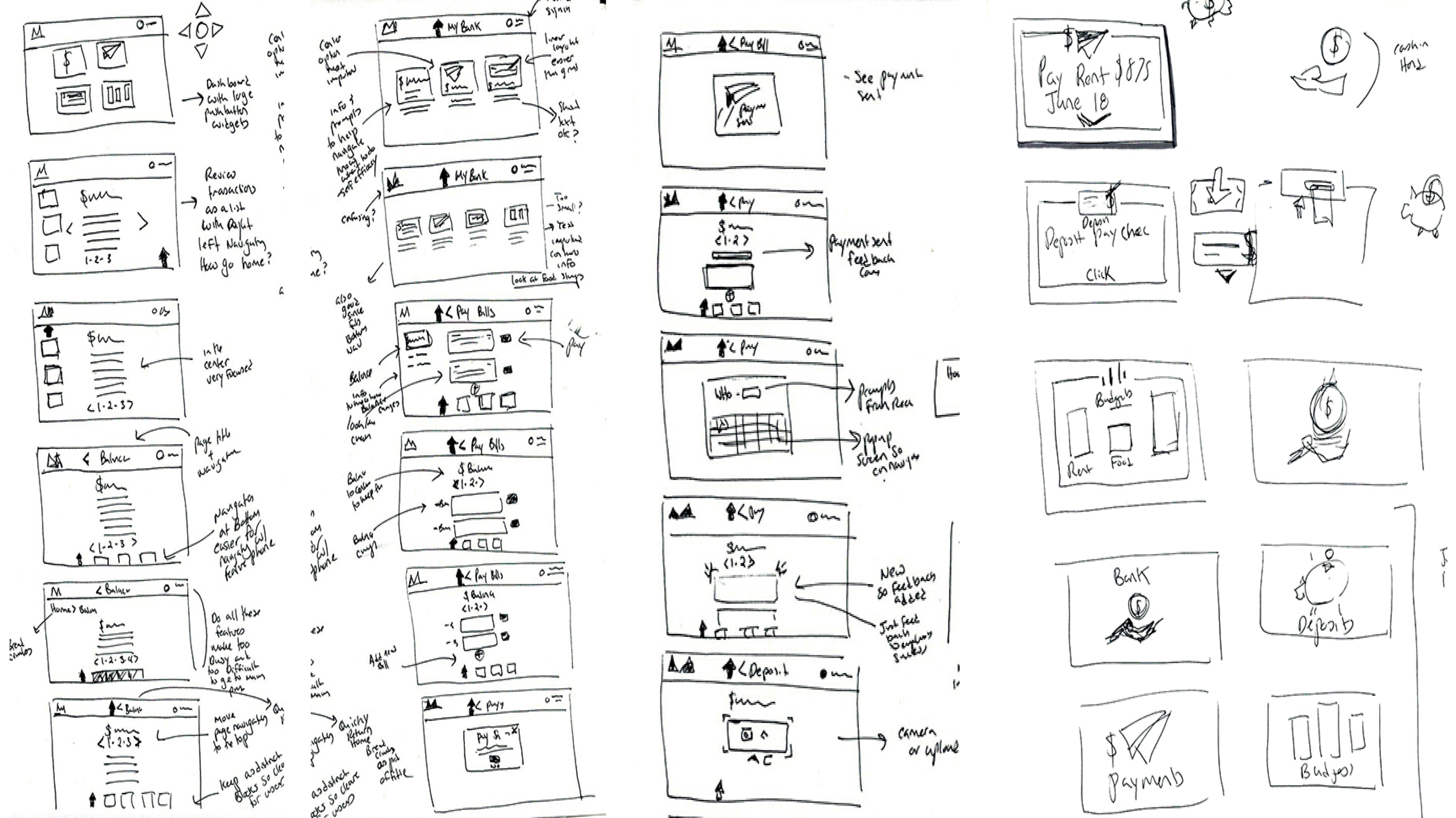
Workflows & Prototyping
I began the UI design by sketching workflows before creating wireframes, which eventually became the interactive prototype. Part of the design process was ensuring that the design supported navigation of a feature phone (where users rely on button navigation) not just a smartphone. This had the additional benefit of maintaining a shallow hierarchy of information which supports the cognitive needs of low-literacy users.

Next steps
After completing this project there are many follow-up steps I would like to take. I would want to validate these designs and guidelines through user testing. Advances in technology (decreased cost of smartphones) may also warrant an update to the design moving away from the feature phone. Significantly there are other parts of the user journey that would need to be addressed such as how does the user learn about the service, how would the on-boarding process work, the logistics for cash withdrawals and deposits, as well as cost. These use cases warrant their own research.
Although this design focuses on the needs of a very specific user group, these needs can also be applied more broadly by considering them from the perspective of the accessibility persona spectrum in which we all experience limitations at some point. If we are operating in a different language or need to do something quickly under pressure our literacy may also be reduced. Design considerations for low-literacy users could in this way support all users.